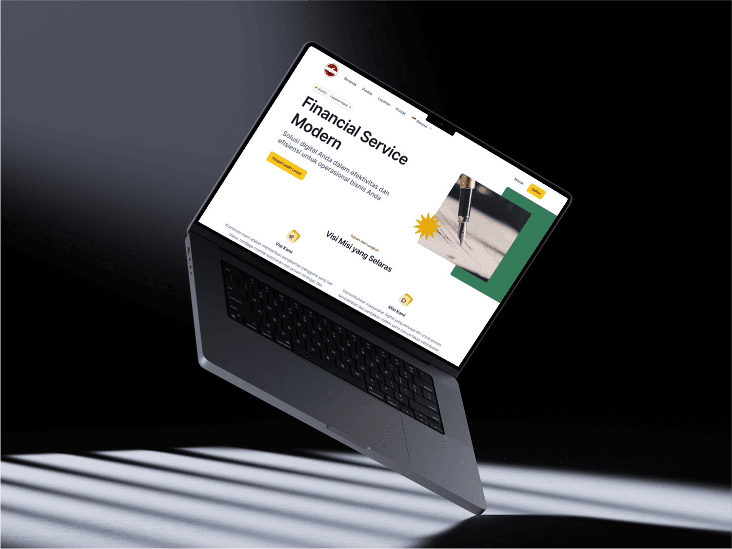
CASE STUDY
Night Zeventien Website Design
Designing for function over form a website built to convert, not just to impress.
———————————————————————————————————————————————————
Role | UI Designer (Solo) |
|---|---|
Client | Night Zeventien via Lunnyy |
Tools | Figma |
Timeline | 2 weeks |
Industry | Clothing Production (Konveksi & Sablon) |
Status | Live : nightzeventien.com |
01 PROJECT OVERVIEW
Night Zeventien is an Indonesian clothing production business specialising in custom t-shirts, hoodies, polo shirts, and uniforms for companies, communities, schools, and events. The project came through Lunnyy as a full website redesign, the client already had an existing website but needed a better version. Working directly with the client as the sole designer, I delivered the complete redesign in 2 weeks.
02 THE PROBLEM
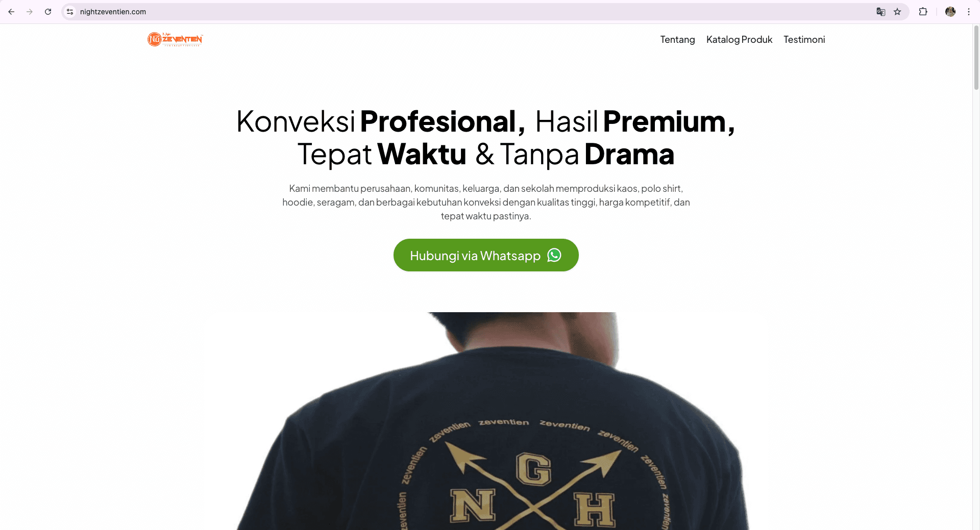
The existing Night Zeventien website had two clear problems. First, the design looked outdated and no longer reflected the quality of the business. Second (and more importantly) it was not converting visitors into customers. The client was losing potential orders because there was no clear, direct path to contact them.
The client's vision for the redesign was specific: they did not want a corporate or overly modern website. They wanted a fast, informative website that serves as a central hub for potential customers, and most importantly, one that drives every visitor toward one single action.
The client wanted every visitor to be directed toward one clear action; contacting them directly via WhatsApp. Function and conversion came first. Aesthetics came second.
03 RESEARCH AND DISCOVERY
Because the client's brief was very specific, my research focused on understanding what 'simple and functional' looks like in web design, without making it feel cheap or unprofessional. I studied how Indonesian local business websites communicate trust and clarity to their audience, and how to present a product catalog in a way that is easy to browse quickly while keeping the path to the WhatsApp CTA as short as possible.
04 DESIGN PROCESS
Rather than presenting one direction, I designed three distinct concepts to give the client real options, each with a different balance of function and aesthetics:
Design 1 : Information-first. Maximum clarity and speed, minimal decoration. Exactly what the client briefed.
Design 2 : Modern and clean. A more contemporary feel while still keeping things simple.
Design 3 : Clean, modern, with more images and richer descriptions. My personal recommendation as a designer.
Presenting three directions allowed the client to make an informed choice based on their real needs, not just my personal taste.

05 THE SOLUTION
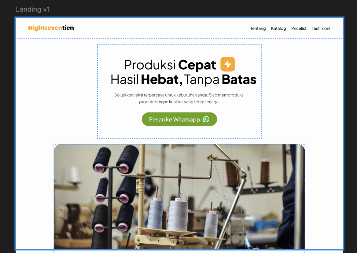
The client chose Design 1 , the most straightforward, information-focused version. While my instinct as a designer was to recommend Design 3, I understood and respected the client's decision completely.
Their audience needed fast answers, and then one clear next step: the WhatsApp CTA button. Every design decision on the page was made to guide visitors toward that single action. The layout, the content hierarchy, and the minimal visual distractions all served one goal: get the visitor to tap that button.
06 RESULTS AND IMPACT
The website launched on time and remains live today at nightzeventien.com. It clearly communicates the full range of Night Zeventien's products and services, with a prominent WhatsApp contact button that makes it easy for potential clients to get in touch immediately. The client received exactly what they asked for a simple, fast, conversion-focused website that works.
07 WHAT I LEARNED
This project taught me one of the most important lessons of my career as a designer ; the best design is the one that solves the right problem, not the one that looks the best.
I learned to truly listen to what a client needs, even when it is different from what I would personally choose. Presenting three design options also taught me how to guide a client through a decision confidently, without pushing my own agenda or taste.
Most importantly, this project made me think like a product designer, every element on the page should serve a purpose. In this case, that purpose was one single CTA: the WhatsApp button. That focus made the design stronger, not weaker.