

CASE STUDY
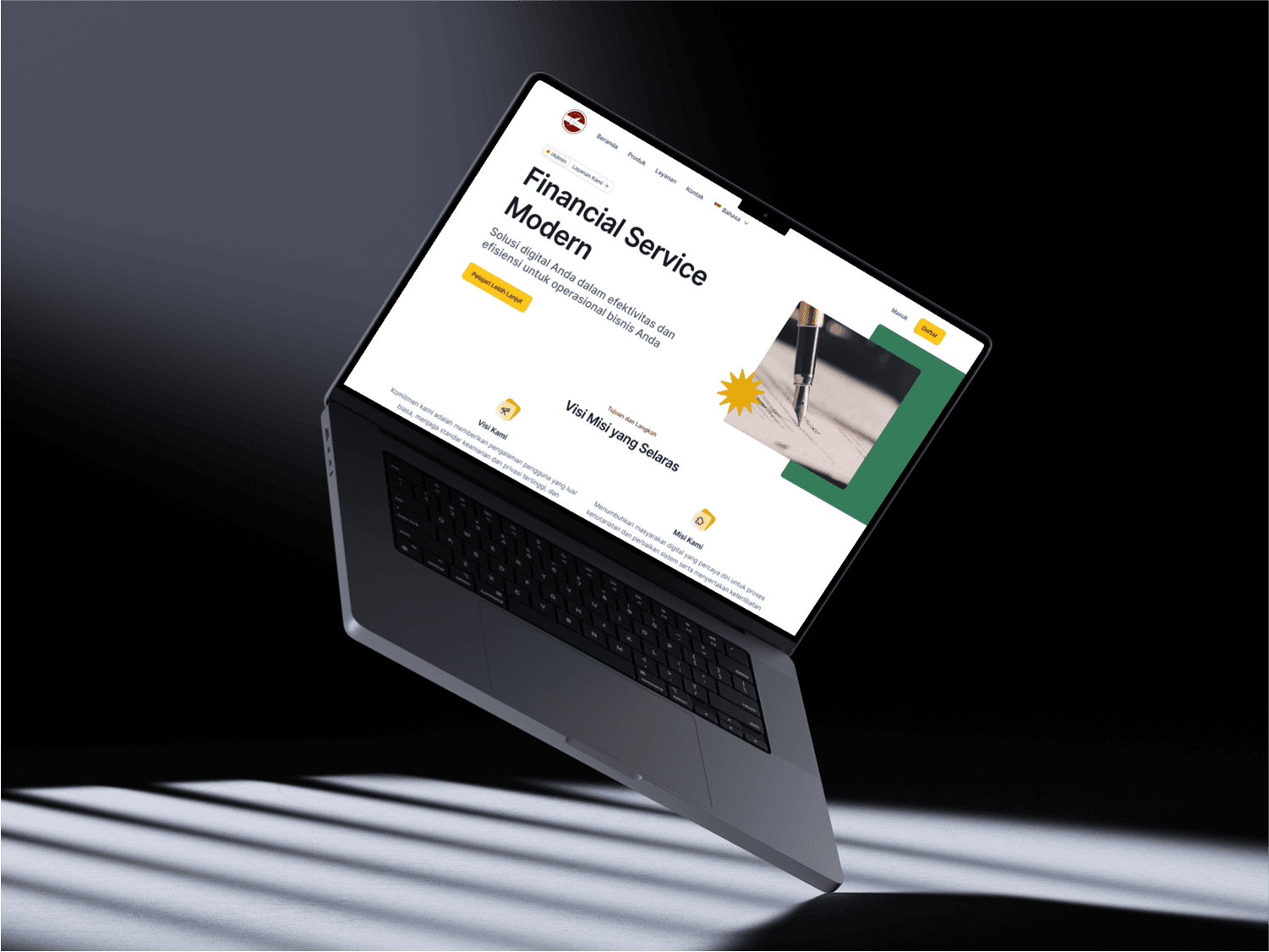
Natadana Website Design
Designing trust for a fiduciary financial service; making the complex feel simple and credible.
———————————————————————————————————————————————————
Role | UI Designer (Team) |
|---|---|
Studio | Pixel Overture |
Tools | Figma |
Timeline | 2 weeks |
Industry | Financial Services (Fiduciary) |
Pages | Homepage · Services page · How it works page |
Status | Live : iadmin.co.id |
01 PROJECT OVERVIEW
Natadana is an Indonesian fiduciary financial service platform; a trusted service that manages and administers assets on behalf of clients. The project came through Pixel Overture, where I worked as part of a design team. As one of my earlier professional projects, I designed the homepage, services page, and how it works page. The project was completed in 2 weeks.
02 THE PROBLEM
Financial service platforms face a unique design challenge; they need to communicate trust and professionalism immediately, while also making a complex service feel simple and approachable.
Natadana needed a website that could explain fiduciary services clearly to potential clients who may not be familiar with the concept, while building enough confidence for them to take the next step.
03 RESEARCH AND DISCOVERY
Working within the Pixel Overture team, I studied how other financial service platforms (both Indonesian and international) present complex services in a simple, trustworthy way. I paid close attention to:
Colour choices that communicate stability and credibility
Typography that feels professional without being cold or intimidating
Content structure that explains a complex service step by step
Financial services require a different visual language than creative or tech brands; every detail needed to feel stable, reliable, and professional.
04 DESIGN PROCESS
The design process was collaborative, working alongside the Pixel Overture team. Being one of my earlier professional projects, I was guided and supported throughout the process; which helped me learn how to work within a professional team environment and align my design decisions with both the client brief and the team's direction.
We focused on making Natadana's services easy to understand at a glance, with a clear content hierarchy across all three pages, leading the visitor from awareness on the homepage, to understanding on the services page, to confidence on the how it works page.
05 THE SOLUTION
The final design used a clean, professional visual language; simple layouts, trustworthy colour choices, and clear typography, to make Natadana's services feel accessible and credible. The three pages work together as a journey:
Homepage : introduces the service confidently and builds immediate trust
Services page : breaks down the offering clearly for potential clients
How it works page : guides visitors through the process step by step
06 RESULTS AND IMPACT
The design was delivered within the 2-week timeline and the website went live successfully. However, during the development stage, the final built product was not fully pixel-perfect compared to the original design; a common challenge in real-world projects when design handoff to development is not tightly managed.
07 WHAT I LEARNED
This project taught me two important lessons. First, being part of a professional team early in my career showed me how collaborative design works in a real studio environment; how to communicate design decisions, take feedback constructively, and align with a team.
Second (and most valuably) seeing the gap between my design and the final developed product taught me the critical importance of clear design handoff and close collaboration with developers. Since then, I have paid much more attention to making my designs developer-friendly: precise spacing, consistent components, and clear specifications.
Every imperfect outcome is a lesson that makes the next project better. This project made me a more complete designer — not just visually, but technically.


