About Lunnyy:
Lunnyy is a creative collective that operates under the principle of “teamlancing”—a hybrid between freelancing and team work. Unlike traditional agencies or solo freelancers, Lunnyy offers a tightly connected team of creatives and strategists who collaborate fluidly across disciplines such as UI/UX design, illustration, HR consulting, virtual assistance, and web development (Framer & WordPress). The website positions Lunnyy not just as a service provider, but as a modern alternative to the agency model: lean, agile, and deeply human.
Vision and Innovation:
Lunnyy’s vision is to redefine how creative services are delivered—moving away from rigid, corporate structures and toward a more collaborative, team-first approach. The innovation lies in the “teamlance” model itself:
It blends the flexibility of freelancing with the reliability of a full-service team.
It focuses on matching the right talent to each project without unnecessary layers.
It challenges the outdated agency-client dynamic through transparency, clarity, and personality.
From a design perspective, the website reflects this innovation through bold messaging, interactive components, and a structure that emphasizes clarity, agility, and connection.
Identifying Unique Challenges
Designing Lunnyy’s website came with a clear challenge: how do you visualize a “teamlance” model—something new, fluid, and undefined—while still establishing trust and structure for potential clients? The brand needed to feel friendly and youthful, but not amateur. It had to explain diverse services without overwhelming the user. And more importantly, it had to reflect the spirit of collaboration while encouraging conversion.
From a UX perspective, we had to guide visitors through a non-traditional offering using traditional digital touchpoints. Structuring the story without sounding corporate, and making it scannable without losing character, was at the heart of the challenge.
Resolving Complex Problems
We approached this by designing with contrast—visually and conceptually.
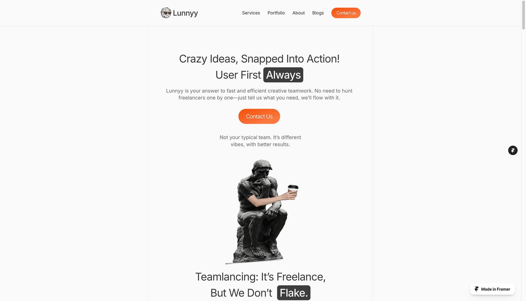
The homepage opens with a bold, unorthodox headline ("No solo acts. No suits.") to quickly establish voice and value.
A visual matrix contrasts Lunnyy with freelancers and agencies, helping users quickly place the brand on a mental map.
Modular layouts with consistent spacing and strong hierarchy make the range of services and team profiles easy to scan and digest.
We resolved content overload by keeping each section purposeful and bite-sized, with microinteractions and anchor points that allow users to explore without getting lost.
User-Centric Design
User flow was a priority from the start. We structured the site as a long-scroll experience with intuitive anchors and lightweight navigation. Visitors can immediately understand what Lunnyy does, browse featured work, explore services, and get in touch—without having to jump between pages.
The tone of voice (playful but clear), the visual spacing, and even the animations are all designed to reduce friction. We wanted users to feel invited in—not sold to. Every design decision was guided by the goal of clarity, personality, and simplicity.
Meeting User Needs
We mapped out core user intentions early on:
“What exactly is Lunnyy?”
“What can they do for me?”
“Can I trust their work?”
“How do I contact them easily?”
To meet those needs:
The homepage acts as a complete story in itself: from concept, to services, to proof, to action.
Portfolio previews show range and visual skill without overwhelming with detail.
Testimonials were integrated early in the scroll, not buried in a separate page—so trust-building happens naturally.
The contact form is embedded, minimal, and smart—streamlining inquiries and reducing dropout.
Detailed Pages and Features
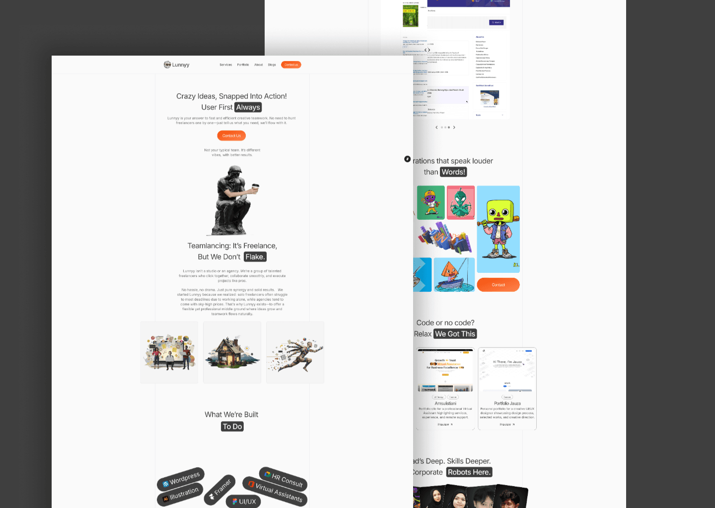
Homepage
Built as a single-flow narrative. Each scroll reveals a new layer: brand voice → comparison → services → portfolio → testimonials → contact.Service Section
A clean, icon-based grid that presents all Lunnyy offerings in a visual, skimmable way. Each item is short, confident, and action-oriented.Portfolio Teasers
Modular thumbnails hint at deeper work, allowing for future case studies to be added without redesign. The aesthetic is clean and editorial.Testimonial Carousel
Simple slider design that adds social proof in motion. Short, punchy quotes keep momentum going.Smart Contact Form
Designed to reduce hesitation. Dropdowns for project type, budget, and a free-text field streamline the inquiry process.
Conclusion
Designing Lunnyy’s website was an exercise in balance: playful but professional, minimal but expressive, new but credible. We built a space that doesn’t just tell people what Lunnyy is—it makes them feel it. Through intentional hierarchy, clear copy, and soft interactions, we crafted a site that speaks to startups, creators, and teams looking for something in-between the chaos of freelancers and the coldness of agencies.
The site isn’t just a visual statement—it’s a reflection of how we think, work, and collaborate as designers.