


About Me
My Tools

Services
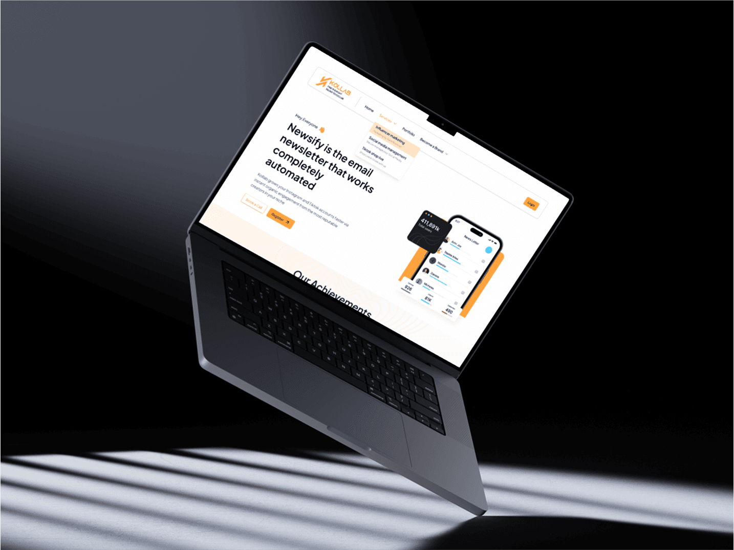
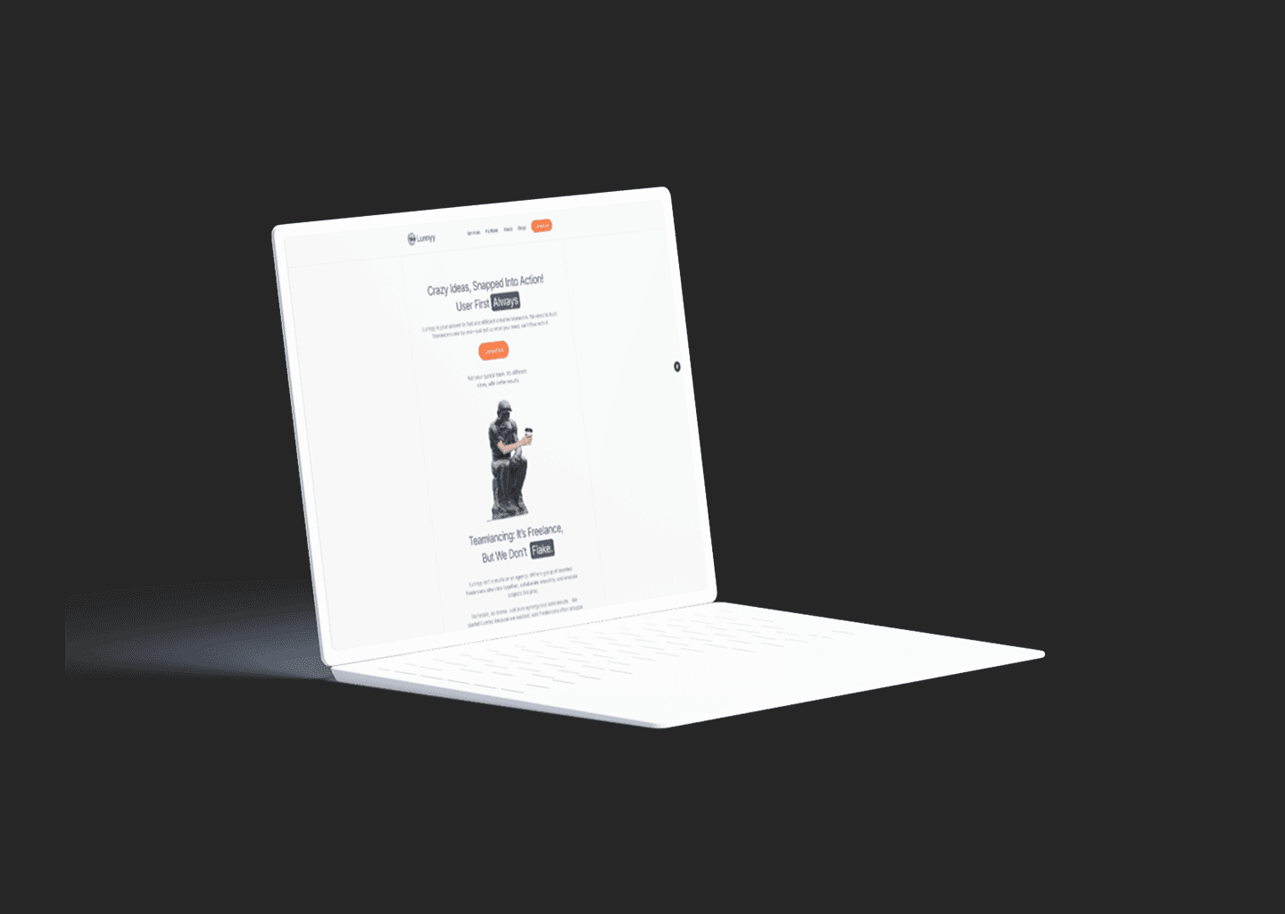
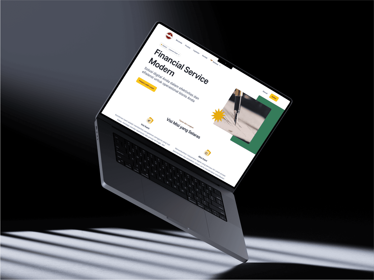
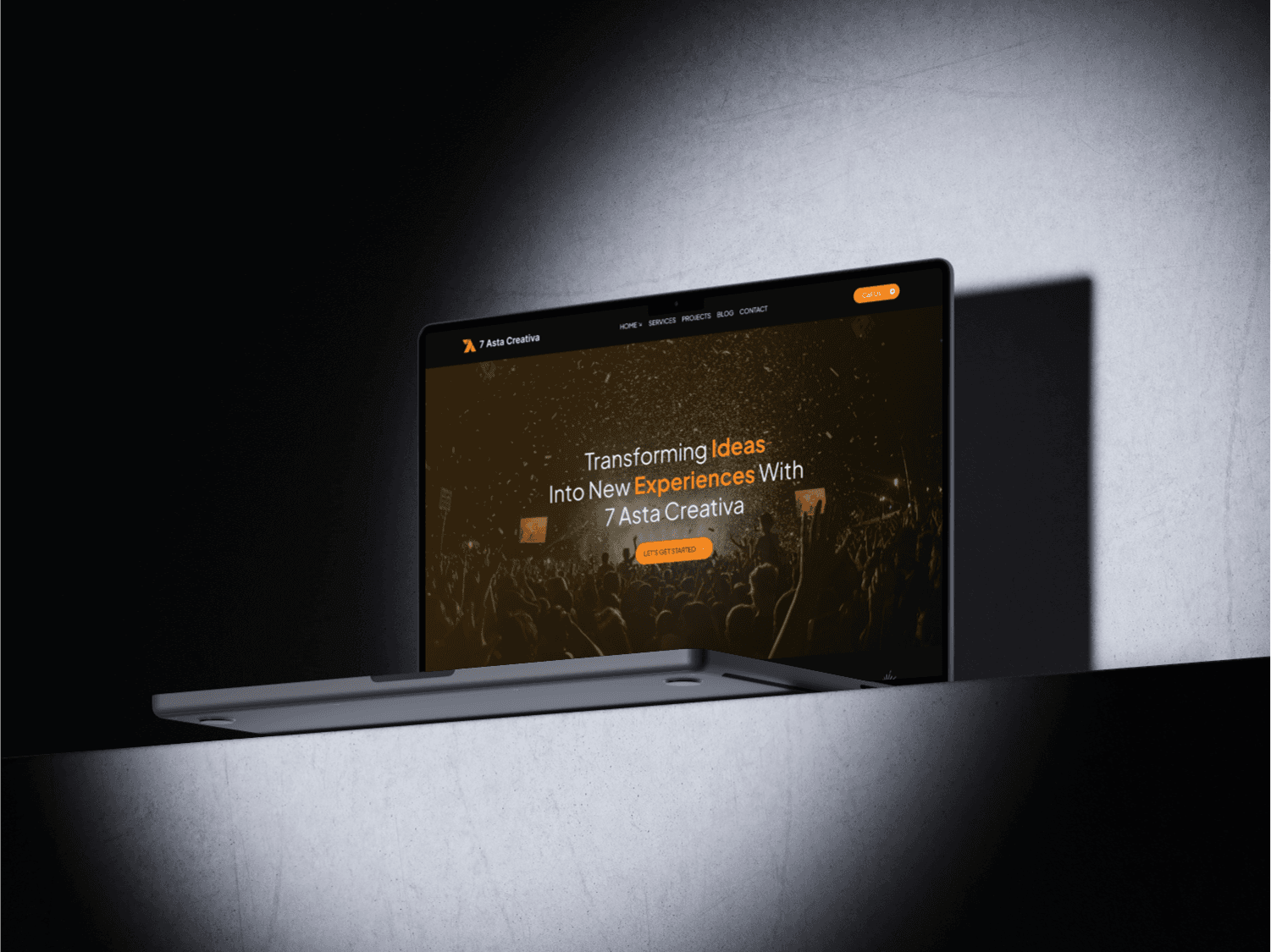
Transform your vision into a reality. This service encompasses crafting beautiful and user-friendly websites that not only captivate visitors but also guide them towards specific actions, whether it's making a purchase, signing up for a newsletter, or contacting you. Our process involves in-depth understanding of your target audience, user experience (UX) design to ensure intuitive navigation and clear calls to action, and front-end development utilizing the latest web technologies to create a visually stunning and functional website.

Mobile app design services are not just about creating visually appealing interfaces, but about crafting an intuitive and efficient user experience. The process begins with understanding user needs through research, mapping out interaction flows with wireframes, and designing a consistent visual interface that aligns with the brand identity. The resulting design not only pleases the eye but also helps users navigate the app's features with ease.

User research is a crucial part of the UI/UX design process that helps uncover real user needs, behaviors, and pain points. This service involves methods like interviews, surveys, usability testing, and competitor analysis to gather valuable insights that guide design decisions. By understanding how users think and interact with digital products, We can create solutions that are not only functional but also relevant and user-friendly.

Don't wait until development begins to see your website come to life. We utilize advanced prototyping tools like Framer to build interactive prototypes that simulate the final user experience. These prototypes allow you to test user flow, visualize interactions, and gather valuable feedback before any code is written. This iterative process ensures your website is on the right track from the very beginning.

Your website needs to look great and function flawlessly across all devices, from desktop computers to tablets and smartphones. Our responsive design approach ensures your website adapts automatically to different screen sizes, delivering an optimal user experience for all visitors, regardless of their device.